
Choosing yarn for colorwork projects
Have you ever picked out two colors, started knitting, and then realized that they don't look good together? Maybe the colors blend into each other, or they don't look good together?
THE COLOR WHEEL
Now, let's just start with the basics. The color wheel can be a great tool when choosing colors. It gives you a variety of color variations, and helps choose colors that will always look good together. I like to use the HTML color code site to easily look at colors. You can change the saturation and luminosity of the colors as needed and also choose color combos.

COLOR COMBOS
Let's break down some of the color combos and what they look like:
Analogous - Colors that are next to each other on the wheel.

Monochromatic - Various shades of one color.

Complimentary - Opposite sides of the color wheel.

Split Complementary - Opposite sides of the wheel, but one side has two analogous colors.

Triad - Three colors, evenly distributed around the wheel.

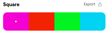
Square - Four colors, evenly distributed around the wheel.
CONTRASTING COLORS
Along with color, you also need to think about the contrast between colors. Are they the same brightness? Is one darker or lighter than the other? What I like to do for this is to take a photo of my yarn options, and then turn the photo into black and white. This will tell you if the colors will blend into each other, or if they will pop and be easily seen.
In the example above, the yellow would work great with either the blue or the pink - it stands out completely. The pink and blue, those play a bit of a trick. In the black and white image, they look similar, but in the color version they obviously don't blend in to each other. Sometimes you just need to make a swatch to find out of they will work together or not!
Sometimes different colors at the same luminance, like the pink and blue, work great together! And sometimes similar colors at different luminances work great also, like a light green and a dark green. Play around with swatches and see what works best for your project.
MUTLICOLOR YARNS
Multicolor yarns really shine best when they are either knit on their own, or knit with a solid color. If you use two multicolor yarns, they usually won't work out how you want them to. Often times the colors will just blend and blob together, you won't have any defining edges to show what you are trying to do. So if a colorwork motif is your goal - use one multicolor and one solid. If you're going for a fun colorful shawl - experiment with two multicolor yarns!

THESE AREN'T "RULES"
These are just helpful tips to help you get ideas on how and what yarns to use. If you are struggling with color combos, then these tips will be helpful to get you on your way. But what's important is to also break the rules! This is where art is truly created. Color outside the lines once in a while. Choosing yarn for colorwork projects shouldn't be scary!
Thank you so much for reading, I hope you liked this article. If you found it helpful, give it a like! If you have questions, comment them below!
I hate blogs covered with ads... therefore I pay for this site so you can enjoy it ad-free. I would love if you could help support me in this by purchasing one of my patterns on Ravelry or on Etsy, or you can buy me a coffee!

Comments